
Monochrome
Beyond Desaturation

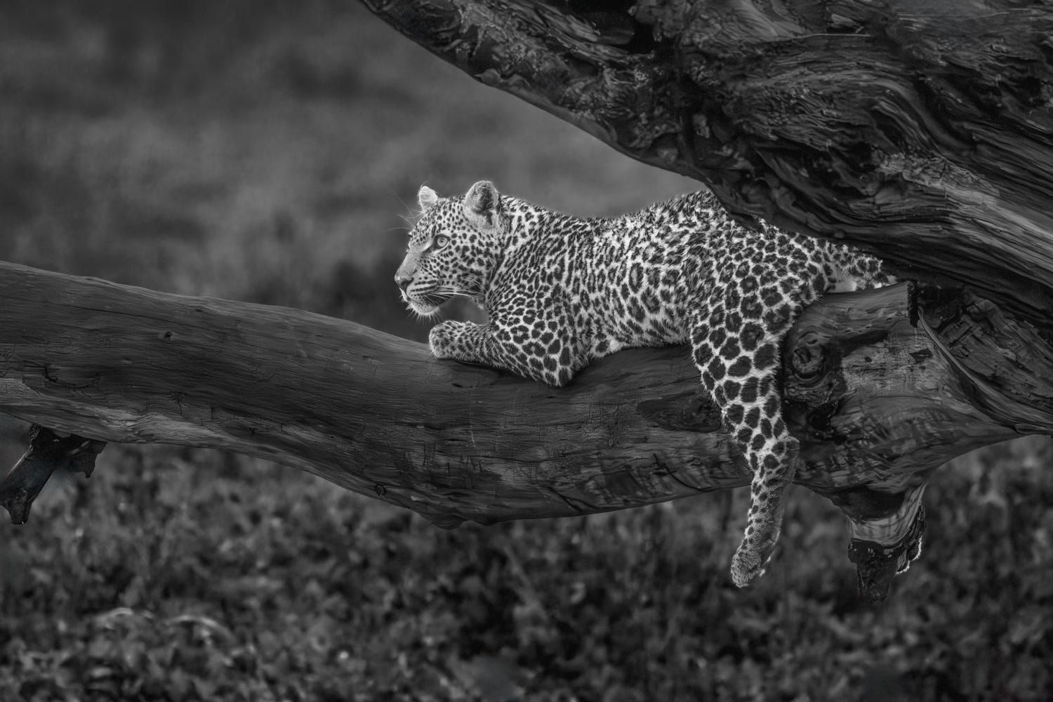
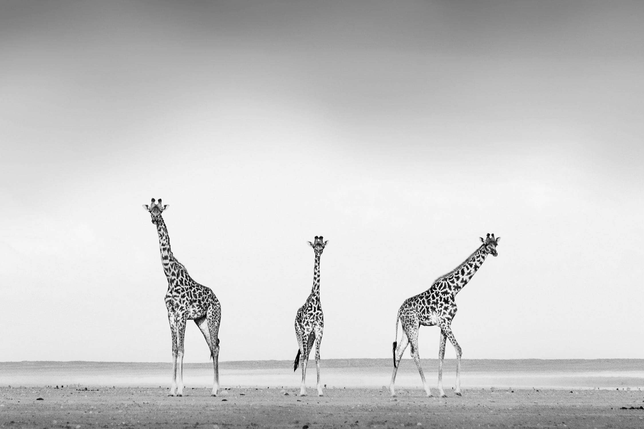
“Walls of the Cave” Serengeti National Park, Tanzania. Canon R5, 343mm, f/10, 1/6 second, 100 ISO.
Color is a fact. Color is reality. Color is how most of us see the world. Color helps tell and describe what something is. Monochrome is expression. It tells you what something means.
The photographer Peter Lindbergh, who almost single-handedly shaped the aesthetic of high-fashion portraiture in the 1980s and 90s, confirms this. He refused color even when everyone else in the business was embracing it. For Lindbergh, monochrome was connected to the image's deeper truth, to its most hidden meaning. He was explicit that this wasn't mere nostalgia. It was ontological. Color, he believed, told you what was there. Black and white told you what it meant.
When color is removed, the image loses its most immediate claim on reality. Paradoxically, this often makes it feel more true. The viewer's mind, freed from processing hue and saturation, leans forward. That gap between the image and the world it depicts becomes a purely interpretive one. Abstraction, handled correctly, generates an emotional authority that color can't always match.
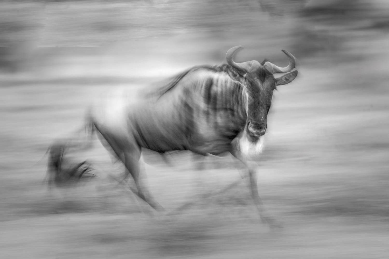
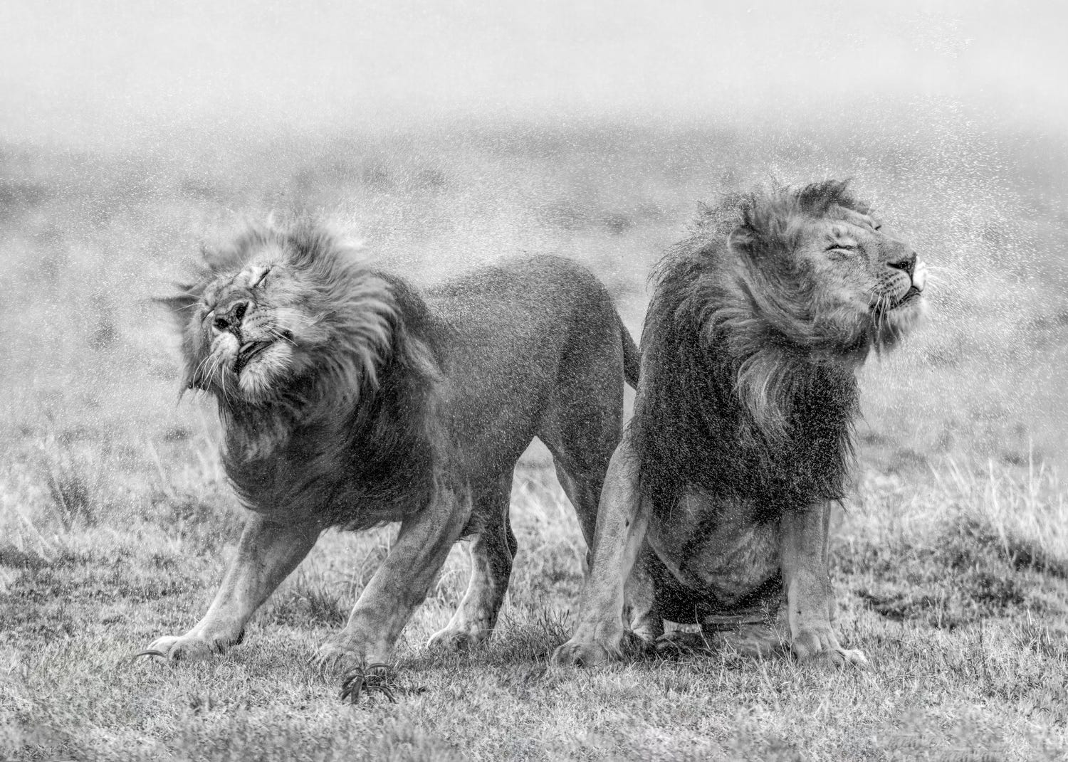
Serengeti National Park, Tanzania. Canon R5, 472mm, f/6.3, 1/800 second, ISO 4000.
Not every image earns the translation. A photograph built on color contrast will collapse when those hues map to identical mid-tones. The diagnostic question is simple: is the image’s structure built from tonal relationships or color relationships? Squint at it. What remains when the details blur is what the monochrome image will be. If that architecture is strong, the image will hold.
What thrives in black and white: directional light that sculpts form, strong shadow geometry, and scenes where color would be a narrative distraction. That last point is underappreciated. Sometimes color tells the wrong story. It dates the image, or pulls attention toward the literal and away from the emotional. For example, warm sunset light carries a cozy, agreeable story in color. Converted to black and white, the same light becomes sculptural and severe. The photographer’s intent determines which version is true.
The photographers who work best in monochrome see in monochrome before they press the shutter. They read a scene in terms of luminosity: not the color of that shadow, but how dark; not the color of that sky, but how much separation exists between it and the subject. Overcast days, which color photographers dismiss as flat, can be extraordinary for monochrome because of how completely they render texture. Harsh midday sun, brutal in color work, can produce graphic shadow geometry worth building an entire composition around.
Most photographers convert to black and white by simply desaturating the image. That's a mistake. Every color in your original photo can map to a different shade of gray, and you get to decide which. In Lightroom's B&W mixer, dragging the blue slider down turns a blue sky dark and dramatic, making clouds pop. Dragging the red slider up brightens and smooths skin tones. This single tool has more impact on your conversion than almost anything else. Most photographers leave every slider centered and then wonder why their black and white images look flat.
The emotional register of a monochrome image is calibrated through its blacks and whites. The instinct to use the full tonal range is overrated. Low-key images with few true whites carry weight and mystery. High-key images with elevated shadows feel airy and uncertain. Neither is correct; both are choices. What does this image need to feel like? What does blocking the shadows protect, or reveal? What does lifting the blacks cost in terms of gravity? These are the questions worth sitting with pressing the shutter.
Dodging and burning is where monochrome photography comes closest to painting. You are redirecting the viewer's eye, deepening or releasing tension, letting some areas rest so others can speak. In color work, the eye is guided by hue. In black and white, tone is all it has to follow. That means your control needs to be more precise and more intentional. Get it right, and monochrome doesn't just work. It persuades.
New Podcast Episode: Deborah Sandidge
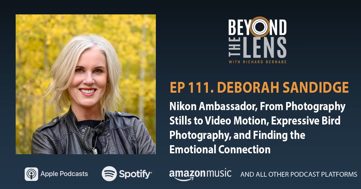
Deborah Sandidge is an American Travel, Landscape, and Wildlife Photographer, a Nikon USA Ambassador, and KelbyOne Instructor. Deborah is the author of Digital Infrared Photography and has collaborated with the Nikon Learn and Explore site demonstrating star and star trail photography, along with long exposure photography.
In this episode, Deborah and Richard explore the creative tension between still photography and video, how to find emotional resonance in birds as a photography subject, why technical mastery is the price of admission for genuine creative freedom, and what does it take to be a professional photographer in 2026. Deborah also shares how she reads animal behavior to anticipate moments before they happen and what it really takes to become a brand ambassador.
Be sure to follow Beyond The Lens on Apple Podcasts, Spotify or any of your favorite podcast platforms.
Here’s to Truth, Adventure, and Passion
This is beautifully said. Monochrome as expression, I love that.
Stunning, as always, cousin…👍👍